


The United States is made up of 328.2 million people, all completely different and unique. However, despite everyone being their own person, we tend to group to people with similar opinions, values, and views as us and live within close proximity. These maps show many of these groups and differences, as well as give us an estimate of just how big the country really is. The maps will give you a totally different view of the red, white, and the blue.
Surprising Total Population
The areas highlighted in red on the map indicate areas that have a total population than the rest of the country, shown in grey, combined. It’s pretty crazy to think that most of the population is crammed into these areas.
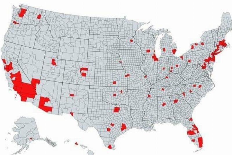
Surprising Total Population
Mongolian Empire, 1279
While we tend to think of the United States as the center of the Universe, it’s important to remember history. For comparison’s sake, the region highlighted in orange shows the reach of the Mongolian Empire in 1279. It actually spans over a total area of land that’s bigger than the entire United States!
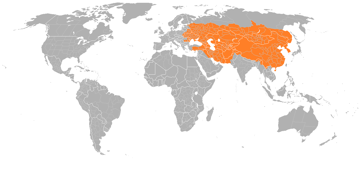
Mongolian Empire, 1279